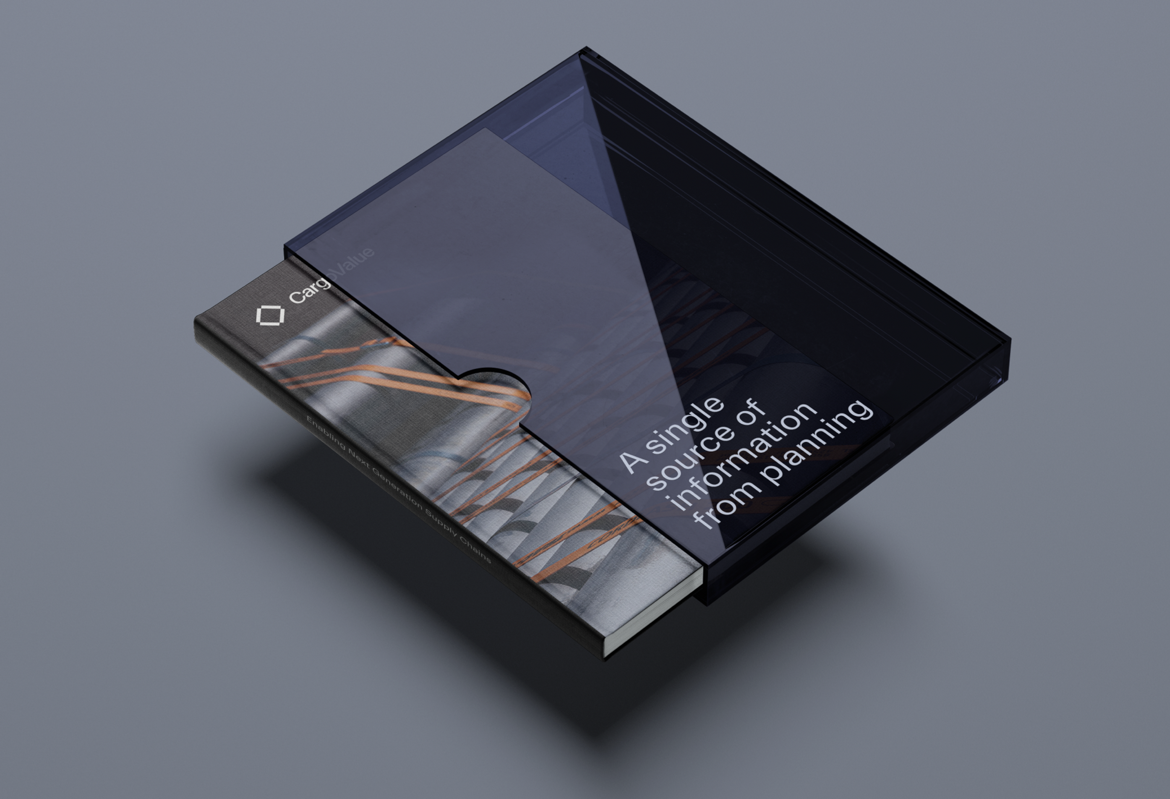
CargoValue
CargoValue is an intelligent logistics platform for industrial companies sourcing and shipping raw materials by sea.
The digital tool is a single source of information from planning to production enabling companies to lower risk and reduce cost throughout the supply chain.
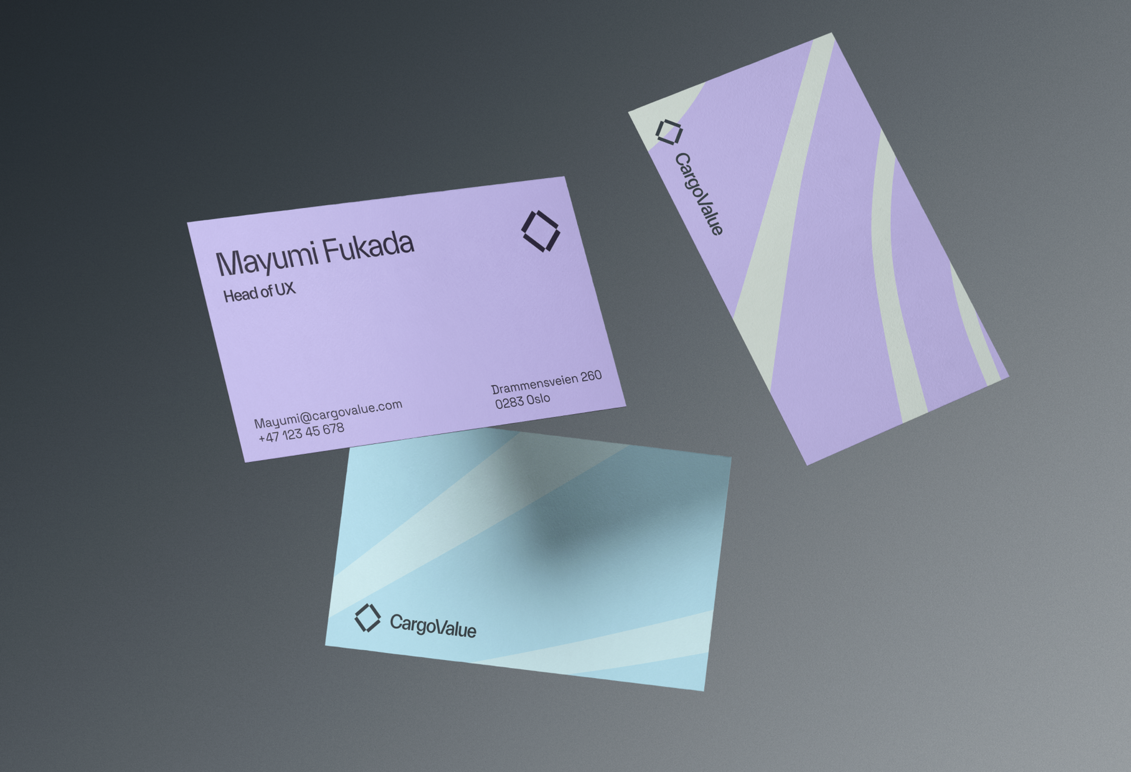
We worked together with CargoValue to understand the target audience and users. With this in mind, we designed an identity that represents and communicates the values of CargoValue. Digitizing an analog behavior can be challenging for some audiences. Our task was to visually embrace them and create a language that could help new and old customers to feel as comfortable as possible
The symbol represent the four pillars in CargoValue. Logistics, Collaboration, Adaptation and Transformation. One of the pillars in the symbol is coloured. It represent all of our users and serves as a reminder to never forget that they are in focus.
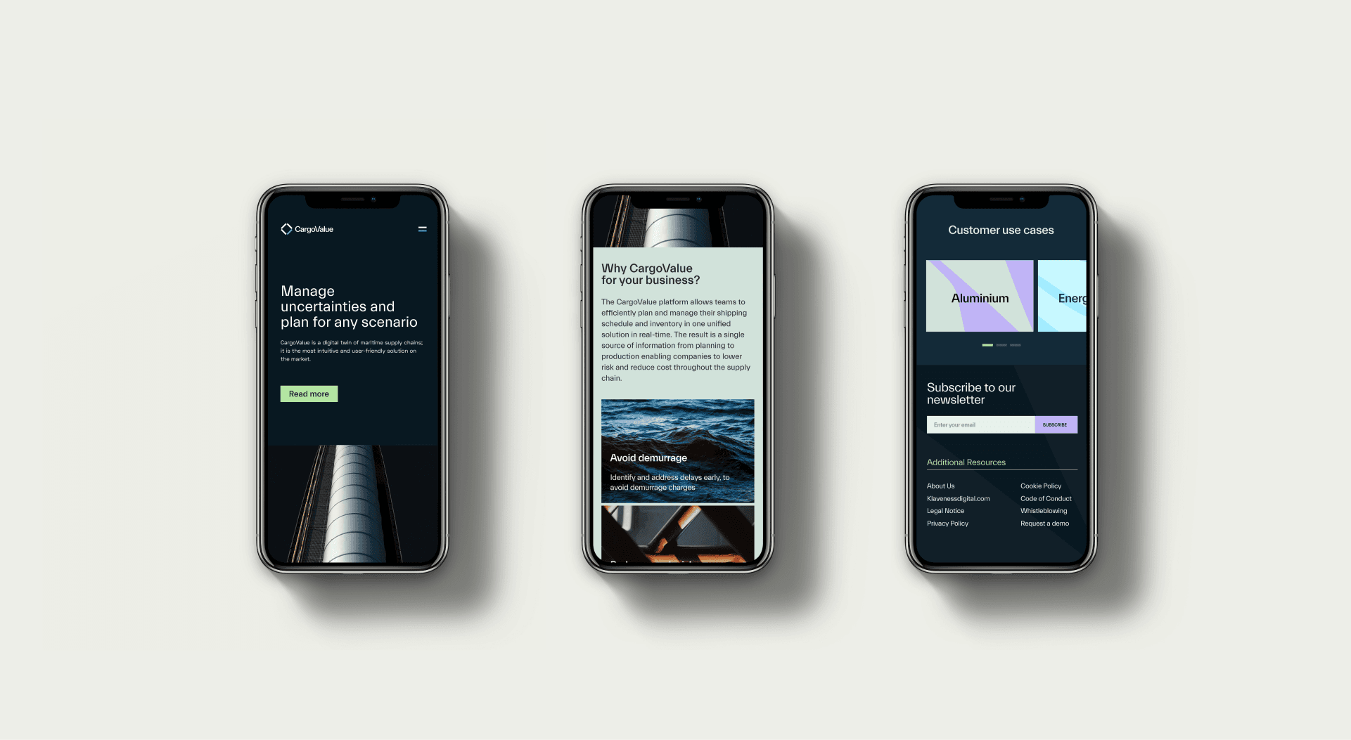
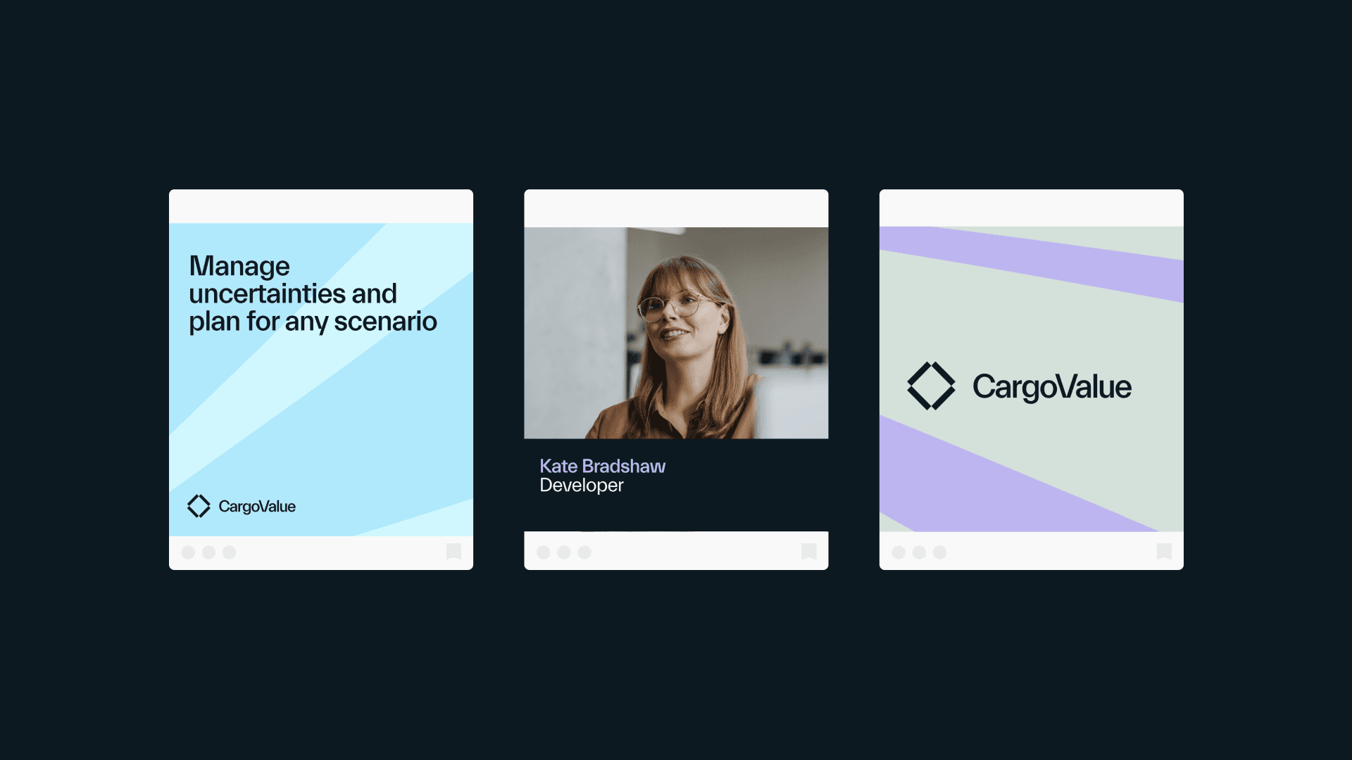
Several graphical tools were developed as a part of the identity
The four shapes in the symbol also represent how CargoValue transforms cargo shipping. Keeping the connection to the sea we opted for a dark and blue base palette in addition to a green and purple to contrast the darker base.
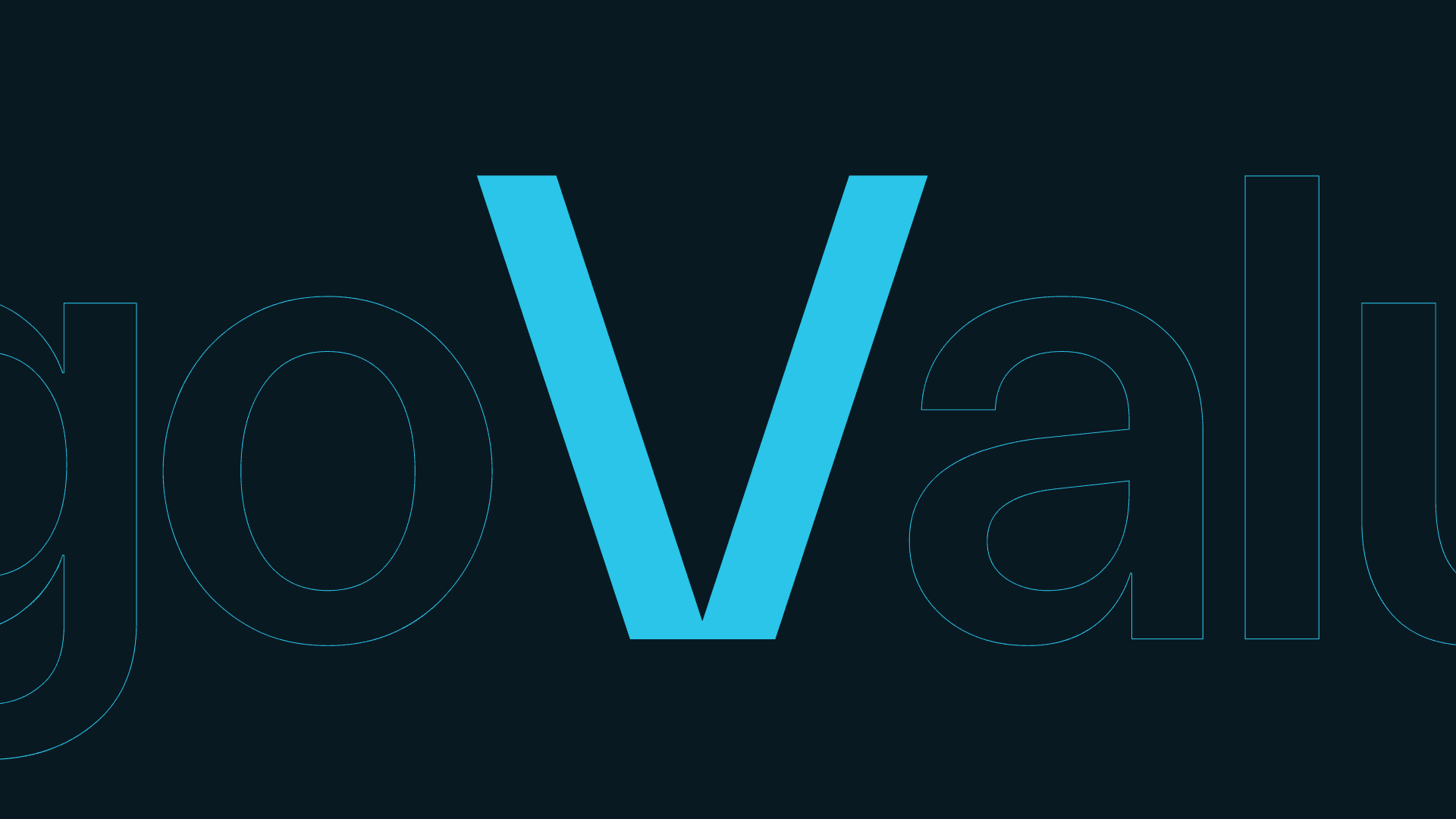
As the main typeface, Everett is a neo-grotesque typeface that perfectly visualizes the exactness and sharpness of how CargoValue operates.