Propely
Propely is a powerful, yet user-friendly, property management tool that provides the insights you need to optimize your properties.
Propely sought to disrupt the visual language and aesthetic tropes of property management. Embodying Propely’s evolution within the industry, our lively and unapologetically playful identity embraces their core values of responsibility, trust, experience, and inclusivity, as well as the character of their employees.

The wordmark was completely remade both visually and conceptually to communicate the personality.
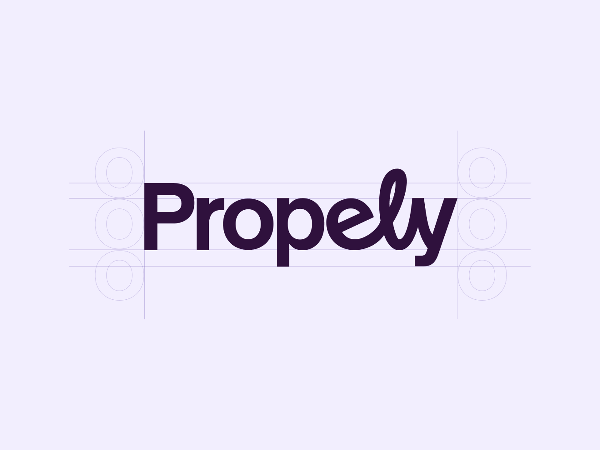
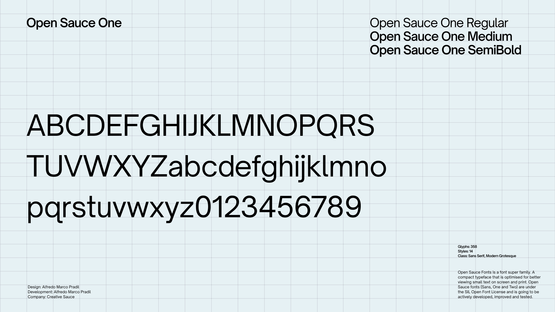
Reflecting Propely’s management style and attitude, we developed a custom typeface for the brand, Propely Sans. Basing the construction on a workhorse sans serif originally crafted by Alfredo Marco Pradil.

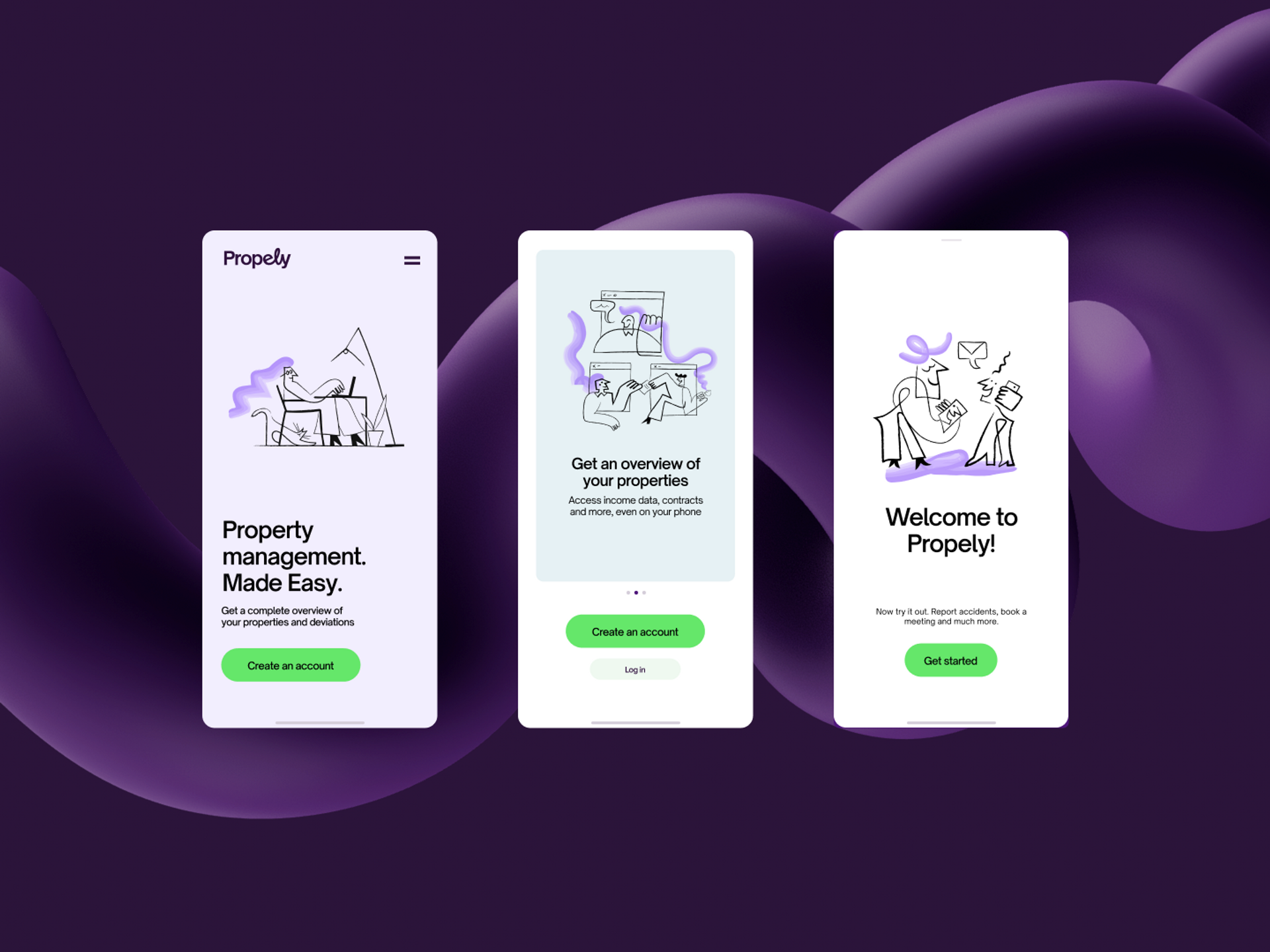
The color scheme breakes Propely out of the traditional actors with a sweet and deep purple that signalises that Propely wont do things like everyone else. Strategically it will also attract a wider audience than the boring "banking, property, insurance blue". Using a wider range of colors than before we can easily adapt them to fit the target audiences.


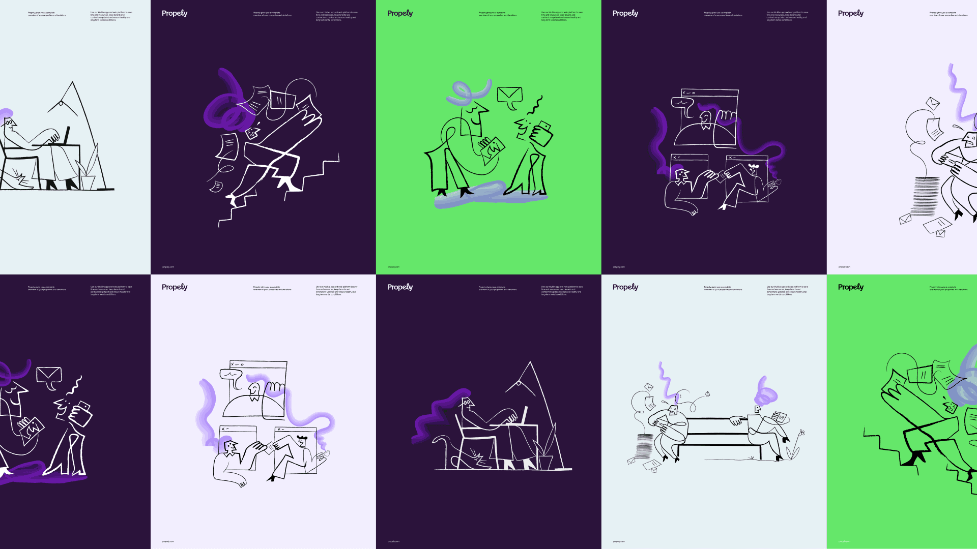
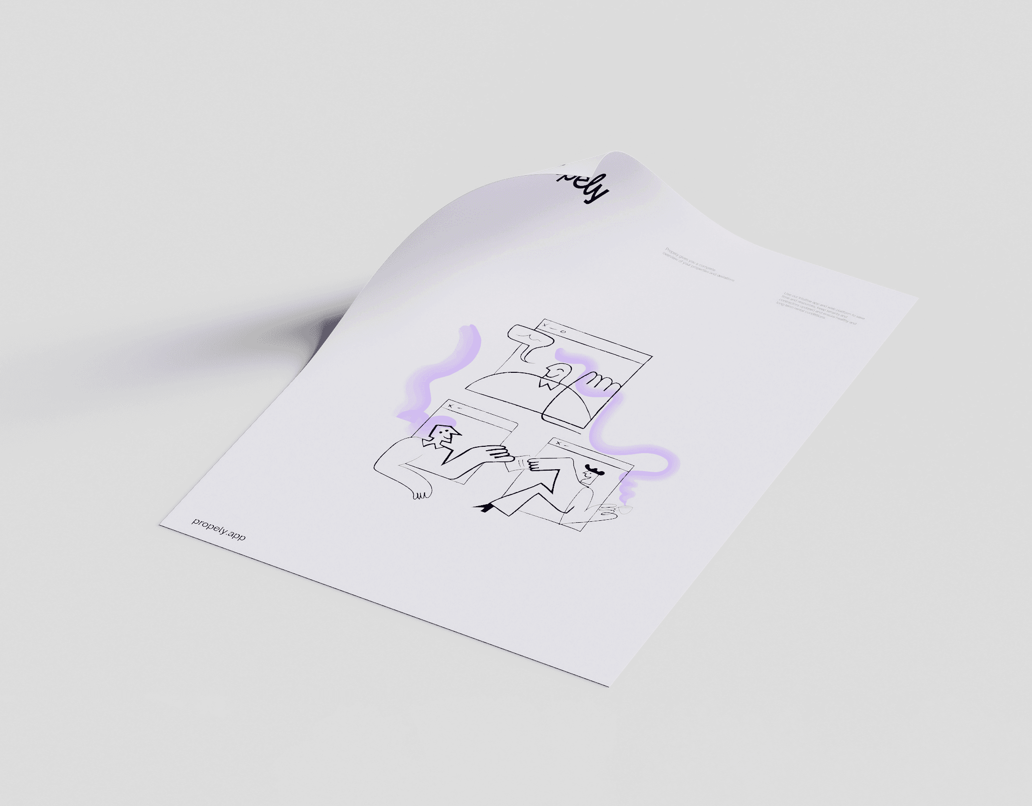
To further establish the strategy we developed a set of beautiful illustrations that can visualise some of the platform benefits that can be hard to show in photography.