Just Action
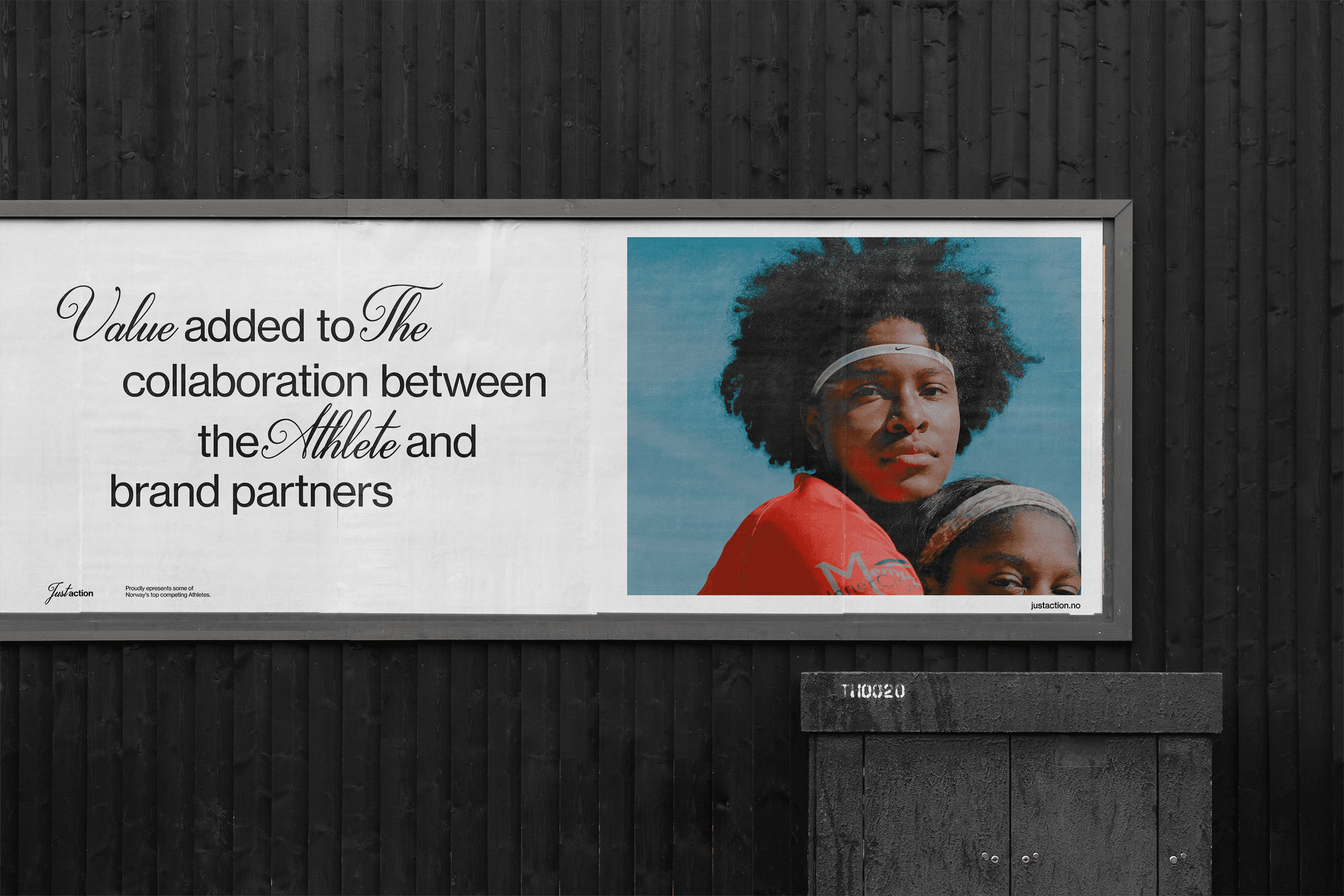
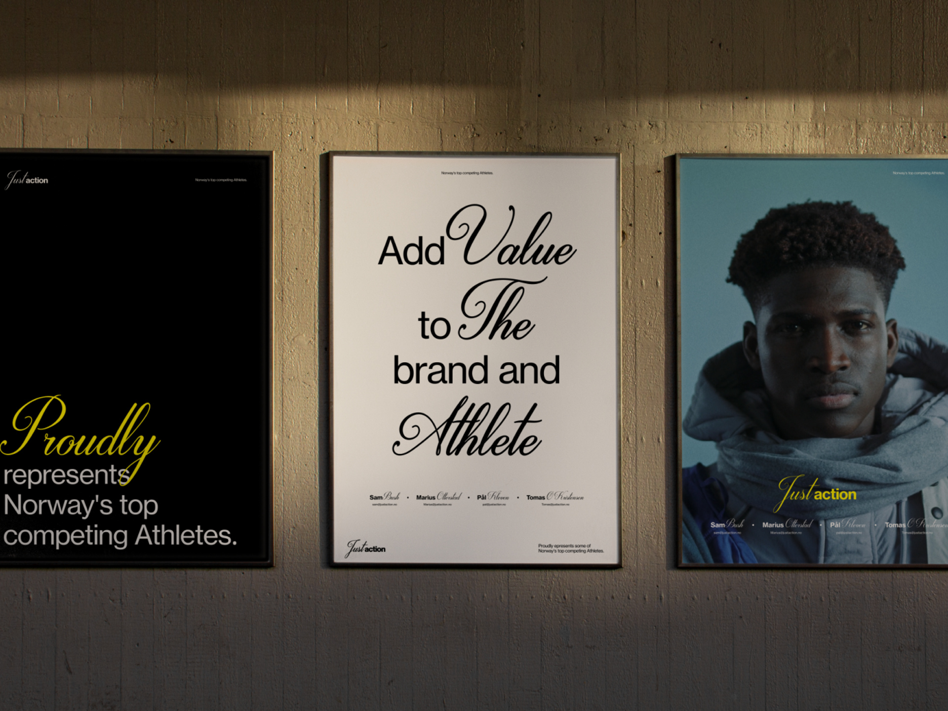
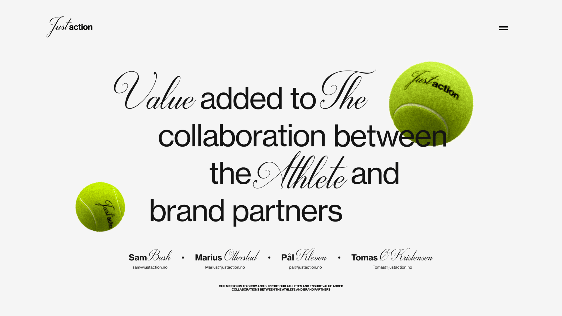
Just action proudly represents some of Norway's top competing athletes.
Just Action was formed with the mission to support, grow and guide athletes as a brand, but also help them navigate and assist with brand partnerships. With a unique mix of brand and legal knowledge, Just action is determined to help athletes to navigate the complex world of partnerships to ensure fair, long term and sustainable partnerships.

We want to prove that it is possible to make something much more inspiring, modern, and effective with very small means. Staying inside the comfort zone does not help anyone.
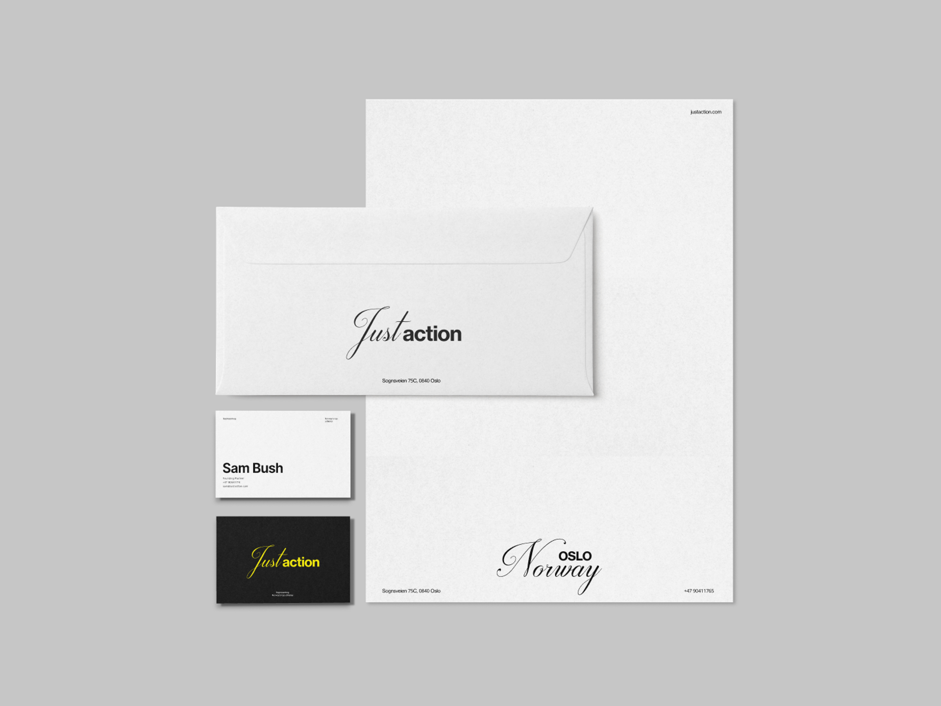
The concept plays on the duality of Just and Action, splitting up the visual language into two different styles representing the two sides of Just Actions' core values. To highlight the conceptual duality of the brand we opted to represent them with high contrast colors.
The typography embodies this duality by mixing two contrasting typefaces
An elegant script and a classic strong grotesk. The result is a simple, elegant, bold, and oh-so-expressive visual world that is also easy to use for anyone. Hopefully, it will inspire someone to push themselves to create something that they otherwise would not have.


The word Just represents equal opportunities and treatment, while Action represents Just Actions commitment to the athlete. Athletes are often poorly managed when it comes to being fairly valued and represented when partnering with brands.